IOS 7 Design Will Most Likely Change For Final Release
During the unveiling of iOS 7 at Apple’s WWDC, there were many mixed reviews about the look of the new operating system that will power iDevices. While many were positive, including most of the Today’s iPhone crew, many others pointed out that there were many inconsistencies in things such as app logos.
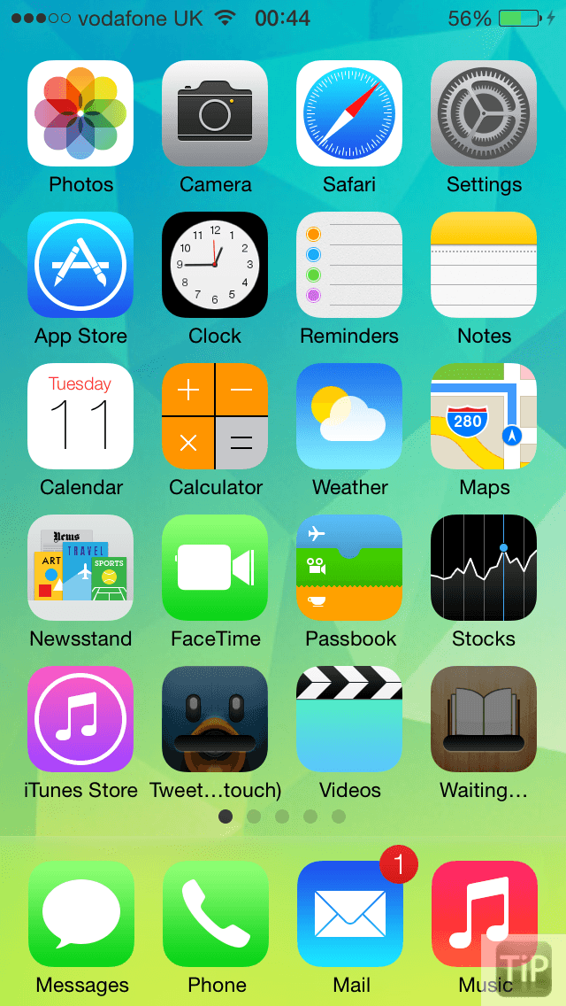
For example, the Safari icon fades from light to dark (top to bottom) whereas the Mail and Weather icons both fade from dark to light (which can be seen in the image above). Many believe that this leads the overall UI to look sloppy.
However, a new report today claims that the design of iOS 7 will most likely change before the final release. According to The Next Web, many app icons were designed by Apple’s marketing team, not by Jony Ive’s app design team.
The icons were then handed over to Ive’s team as a color pallet to design the internals of each app. However, it is also reported that the different teams (such as the team assigned to Safari and Mail) were kept separate and that is what led to the inconsistencies in app icon designs.
While the iOS 7 that was shown off to developers seems like a good product, it is apparently no where close to being a finished product.
I have had the pleasure of using iOS 7 for the past couple of days, and I personally haven’t encountered many of the bugs that have been reported, and am fortunate enough to have my OS run fairly smoothly (except for the extra battery drain). While I have had a good experience with iOS 7, and the icon differences don’t bug me at all, I am glad to see that Apple’s design team is still hard at work with iOS 7.
The Next Web claims that the current beta released to developers is a “mid stride” snapshot of what to expect from the final release, and that some of the demos used on stage at WWDC were actually newer versions of the software than what was released to developers.
It is believed that many of the app icons will be changed before the release to consumers, and updates to betas will be more significant than previous versions of iOS betas.
Are you glad that Apple is still hard at work redesigning iOS, and fixing many of the little issues with the current beta? Do you think Apple should’ve waited to reveal the new operating system until it was closer to being complete? Leave a comment below and tell us what you think.