IOS 6 Overview: Phone (Reminders, Replies And Do Not Disturb)
One feature often ignored by smartphone operating systems is the actual phone user interface. Making and receiving calls has become such an unimportant feature of a smartphone that you could be forgiven for not remembering what the dialing pad looked like.
The biggest update in terms of calling are the Reminders, Replies and Do Not Disturb features. But, before we get to those, let’s remind ourselves of how the keypad looks.
Dial pad UI
iOS has used virtually the same keypad since its birth in 2007. White typeface with a dark blue/black background. Scott Forstall’s team decided it was time for a change. The typeface has changed, and the keypad is now a much lighter color.
It’s a much cleaner, and classier look. Another gutsy move by Apple. The original dial pad was iconic, and instantly recognizable as an iPhone UI. This change shows Apple isn’t scared of changing parts seen as “untouchable”.
Replies and Reminders
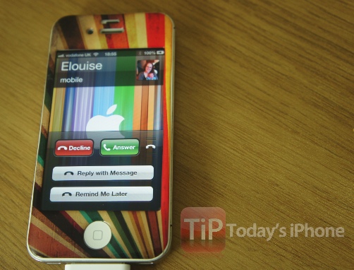
Another incredibly useful feature – if you can get it to work – is the option to reply to a call with a message or set a reminder to call them back. Sadly, with my carrier – for whatever reason – it’s not playing ball.
Once I select to do one or the other it immediately declines the call and leaves the caller with my voicemail. Let me know how the experience is for you on this one. In theory – it’s awesome. To access the features, slide the handset logo up when receiving call in the same way that you’d access the camera from the lock screen.
[UPDATE: It’s working fine now, very useful, but still sends caller to voicemail.]
Do Not Disturb
Putting your phone on silent has been the default way to ignore calls and notifications for years. Now, you can tell your phone to ignore everything just by switching on “Do Not Disturb”. This new feature can be switched on automatically, or scheduled using the Notifications settings.